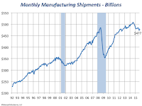
 As I pointed out in an earlier post in this blog, manufacturing shipments have been relatively robust. Overall they have followed a positive trend, of course allowing for declines associated with economic recessions. Since 1992 shipments have doubled, translating into a 4.4% annual growth rate.
However, during this same period prices measured by the GDP Implicit Price Deflator rose by slightly over 50%; that is a 2.4% annual rate. After deflating the shipments data we find that the 4.4% annual growth is only 1.3% in real terms. Naturally, applying such a broad price measure does not give an accurate measure because price inflation varies among industries. Case in point is the sharp drop in petroleum and natural gas over the last couple of years, a decline that did not result in similar price reductions in other industries that depend in oil products.
Changes in Industry Structure
Since 1992 there have been several important changes in the structure of manufacturing, as one would expect. An economy is not a static entity but, rather, is one in which change is prevalent. At the micro level, old factories close and new factories spring up, production in individual factories goes up and down depending on the whims of consumers who may want more or less of the products made by those factories. At the macro level, we see new industries being born making products that nobody may have thought of up to that point, event though many make claims to it, or we see whole industries lose significance or disappear altogether.
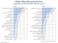
 The chart to the right compares 21 broad manufacturing sectors in 1992 and 2015, where we use shipments data through September for each of the years. The charts allow us to see two types of changes. One is in the percentage of manufacturing accounted by each sector, such as the 1.4 percentage points gained by Transportation Equipment (that includes autos, trucks, aircrafts, etc.) or by the Food sector.
The second type of change is the relative ranking of the various sectors within manufacturing- these changes are indicated by the green and red arrows and they highlight significant changes. Such is the case of Petroleum and Coal that, unsurprisingly, jumped to number four with 5.1 percentage point increase in share. At the same time we see sectors such as Computer and Electronics that fell three places to number seven with a 3.4 percentage point decline. Although I am not investigating causes for these declines, one can surmise that this reflects production shifted to overseas locations for cost considerations.
The good thing is that four out of the top five manufacturing sectors, that account for nearly half of manufacturing shipments, are also among the ones with the highest hourly earnings; the exception is Food Products Manufacturing with workers in this sector earning 24% below the average hourly manufacturing wage.
Manufacturing Losing Ground
 Compared to other industries within the U.S. economy we find that manufacturing is not keeping up in general with overall growth in the economy. In terms of total output, manufacturing accounted for over one quarter of the output of all private industries in 1997 (the earliest year for which we have data). By last year, the share of manufacturing had fallen to just over a fifth of gross output.
Some of the decline in manufacturing is due to the long-term shift towards increased reliance on services. For instance, health services is an area where usage has increased, as shown by the two percentage points increase in the charts to the right. An given Obamacare's mandates, we should expect health's share of gross output to increase further in the next few years.
No comments:
Post a Comment