Monday, November 20, 2023

Smaller Houses

 Newly built houses are getting smaller and smaller. Single family houses started in the third quarter of this year were 2,430 square feet, average size. This is 82 sq. ft. smaller than a year ago. For multifamily units the average size also fell, to 1,032 square feet which is 55 sq. ft. less than the same quarter last year. This is according to the latest housing starts data release from the U.S. Census Bureau.

The decline in house size, on top of the drop in the number of houses started this year, implies smaller demand for construction products going into residential sector. Year to date through October 153 thousand fewer houses were started than in the same period last year. Fewer houses combined with the reduction in house size translates into a loss of 10.9 million square feet of floor space so far this year (approximately). 7.7 million is from single family houses and 3.2 million in multifamily housing units. 

House size has been falling for at least ten years in both single and multi family houses. Single family houses were largest in 2013, when their average size was 2,701 square feet, 271 square feet or 10% larger than today. 

The median size of houses has also fallen during the same period. The median for single family houses was 2,221 sq. ft. in the third quarter, also 10% less than its peak size of 2,491 sq. ft. in 2013.

The decline in the size of multifamily housing units has been falling longer. Peak size was reached back in 2007 when the average multi unit measured 1,342 square feet. That is, multifamily units were 310 sq. ft. bigger that year.

One reason explaining larger multifamily houses around 2007 is that a greater number of units were built to be sold as condominium houses. Condominium multifamily units are typically larger than rental units. For instance, in 2007 four in ten of the units (40%) were destined as condominiums- 60% were built for rent. In contrast, virtually all the units built last year (97%) were rentals. 

Regionally, we find that the Northeast has the biggest new single family homes. The average size in this region in the third quarter of this year was 2,562 square feet, although it declined by 6.9% or 189 sq. ft. from last year. This year's sharp drop brings the average size in this region closer to what it was in 2018.

The average size in the other three regions also fell, although by smaller percentages than in the Northeast Their average size also has declined over the last ten years. 

The second largest reduction in size was in the South region, with a 4% drop to 2.473 sq. ft. in the third quarter. The South region also boasts the second largest new single family houses.

The West region's single family houses are the third biggest of all four regions, with an average of 2,395 sq. ft. Also they had the smallest drop in size last year, new houses are just 1.2% smaller than a year ago.
The smallest single family houses are built in the Midwest region, with an average of 2,237 sq. ft. this year. The size of new homes in this region has also been declining for a decade now, ending with a 2.4% drop last year.

Similar to the regional trend in the size of single family houses, we find that multifamily housing units in all four regions have become smaller for more than a decade now. Further, with the exception of the Midwest region where houses this year are actually larger than a year ago, the size of multifamily houses fell last year in the other three regions.

The size of multifamily houses in the Northeast region saw the biggest drop this year, with a 10% decline bringing the average size to just 853 square feet. The South and Midwest regions had similar declines, of 8.1% and 8.2% each, respectively. The average unit size is also very similar with units in the South region measuring 1091 sq. ft. on average. This is slightly higher than the 1,056 square feet in the Midwest region. 

Housing units in the West region measure currently 995 sq. ft. on average, just 5.3% smaller than a year ago. 


Friday, November 10, 2023

Construction Markets

  • Total construction is up modestly 0.4% in September but a more robust 8.7% from last year.
  • The bulk of the gain from last year originates in the nonresidential sector, which is up 19% while residential construction fell by 2.1% since September of last year.
  • The principal growth drivers overall are Manufacturing buildings, up 62%, Education buildings, up 19%, Power buildings, up 16%, and Health Facilities, up 15%. 
  • Construction of manufacturing buildings rose $76 billion over the last year, accounting for nearly half (48%) of the increase in total construction. 

The U.S. construction market remains relatively strong overall, although signs of weakness are beginning to show up. Spending for all types of projects, public and private, rose 0.4% in September reaching just under two trillion dollars ($1.997 trillion annual rate). September marks the ninth consecutive month when spending for construction projects increased- bringing spending to a level 8.7% higher than the same month a year ago. In real terms, that is adjusting for inflation, spending is 5.5% above last year. 


Spending across the two major major segments, i.e. public and private construction, rose in September (see left panel of chart below). Total private construction is 0.4% higher than the previous month reaching $1,556 billion (that is $1.6 trillion) in September. Private construction accounts for 78% of the U.S. market and is 6.9% higher than last year.  

Public construction also rose in September, coincidentally by a similar 0.4% but to a smaller $441 billion. It is 8.7% higher than the same month last year and currently accounts for slightly over one-fifth of the market (22%.) September also marks all-time spending highs for both private and public construction.
Private construction has grown by nearly four times over the last thirty years. The data in the charts, which begin in January 1993, indicates cumulative growth of 352%; that is from $344 billion back in early 1993 to the 1,556 billion this year. 

Public spending for construction projects has also increased but at a smaller magnitude, rising by 287% over the same period. That is current spending of $441 billion is nearly three times the $113 billion in early 1993. 

An alternative segmentation of the data is the most common division between Residential and Nonresidential projects, shown in the right panel in the chart above. Both follow similar patterns although nonresidential lags residential by more than two years, reflecting the fact that it takes longer to initiate and complete nonresidential projects.  

Earlier this century, around the 2008-09 recession, residential peaked in January 2006 with $681 billion spent, while nonresidential peaked more than two years later in October 2008 reaching $719 billion. Both of them bottomed around 2012 and have risen sharply since then. 

The Fed's policies maintained over the last ten years or so had driven mortgage rates to levels below 5%- we had not seen rates below 5% since at least the early 1970s. Such low rates encouraged construction of both residential and nonresidential projects. Although the recent increases have not impacted nonresidential construction yet, their impact on residential is already evident as the chart above shows.

Residential Construction
  • The residential market remains relatively strong, driven primarily by construction of multifamily housing units.
  • Although it is expected that multifamily construction will ease in the near future as the record number of multifamily units currently under construction are completed. There are currently over a million units under construction, equivalent to roughly two years' demand.
  • Single family housing continues to fall.
The bulk of residential construction today emanates from the private sector. Residential buildings publicly funded are just around one percent of the total, except for a short period around the 2008-09 recession when public residential construction rose to about 5% of the total. Currently, public spending for residential construction lingers around ten billion dollars, a small figure in relation to the $882 billion overall residential market. 

Thus here we concentrate on the private sector, which represents the bulk of the residential sector.
Residential construction data from the Department of Commerce estimates is available for three different segments: new single family housing, new multifamily housing and expenditures by homeowners for remodeling. Combined these three segments are generating $872 billion annually, but adding the pubic sector the total rises to $882 billion. 

The increase in construction over the last few months originates from greater activity in both single and multifamily housing. Although new single family housing had been falling since early last year, it reversed course in May of this year but it barely reaches a similar level it had in November last year. That is, single family construction is running at slightly over four hundred billion ($402 billion annual rate, shown in the chart below). Single family rose 1.3% in September but it remains 5.9% below a year ago.
 
Multifamily construction, on the other hand, paints a more rosy picture. Construction of multifamily housing units has been increasing for at least a year now. However, the construction pace has been slowing down gradually, in September construction actually fell, albeit by a negligible one-tenth of one percent (0.1%). Spending on multifamily houses reached $136 billion in September, the highest amount ever recorded for this sector. 

We'd anticipate further declines in multifamily construction. The increases in mortgage rates, which have reached nearly eight percent recently and are one percent and a half higher than the beginning of the year, are forcing builders and developers to slow down construction. Further, the huge number of multifamily units currently under construction, which currently exceeds one million units, is putting pressure on builders when these units are completed and put on the market.  

Homeowner remodeling spending has also fallen recently- it fell in seven of the last twelve months. Spending in September was $334 billion, 5.4% lower than a year ago. Higher mortgage rates have made remodeling projects more expensive naturally.

Nonresidential Construction Sector
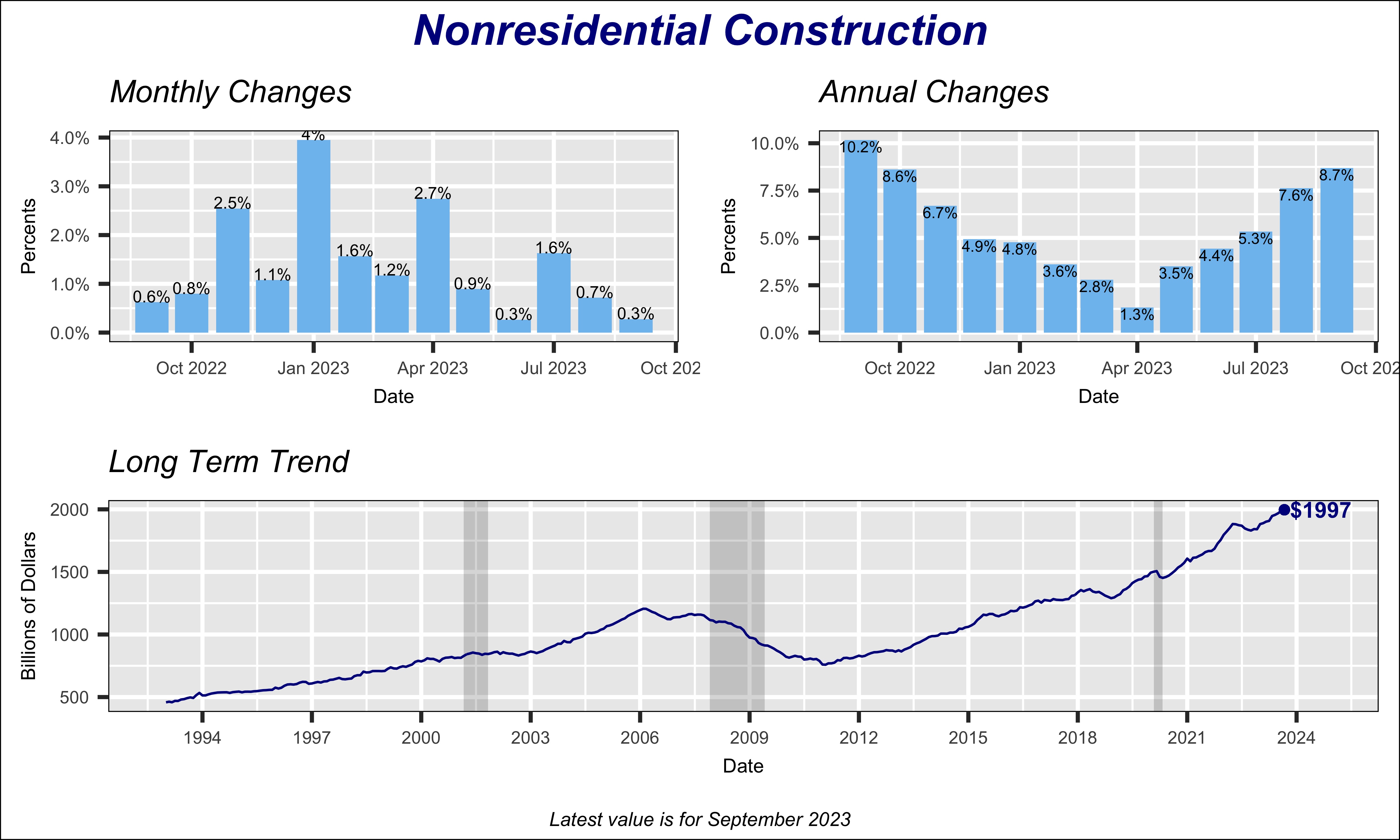
Overall nonresidential construction has been rising more or less steadily since 2011, to reach $1.11 trillion in September of this year (at annual rate.) Spending dropped modestly by 5.4%, in the aftermath of the Covid pandemic, between January 2020 and June 2021. But it recovered strongly since then by rising 33%     in the last year and a half. The growth pace has been slowing the last few months, however, as can be seen in the "Monthly Changes" graph in the chart below. Compared to September of last year, nonresidential construction is 8.7% higher.


Currently, the biggest contributor to nonresidential construction is manufacturing, shown by the red line in the chart below, which shows major nonresidential construction types as percent of the nonresidential total. Historically, construction of manufacturing buildings represented under 10% of total nonresidential market, except for a few years around 2015 when it briefly exceeded 10%. But the emphasis by Federal government policies to support a shift towards electric automobiles has boosted manufacturing construction to nearly 18% of the nonresidential sector. 


 Data Source: U.S. Department of Commerce


Saturday, October 14, 2023

States' Unemployment Claims

Last week’s  unemployment claims were unchanged from the previous week, although they are still about 5% higher than a year ago. For all practical purposes claims have remained relatively flat over the last year reflecting, no doubt, the reluctance of businesses to lay off workers given the difficulty of finding persons to fill positions. Job openings are still elevated with a total of 9.61 million in August, yet they are 2.4 million fewer than a year ago when openings total was 12.0 million. Relative to the number of persons unemployed, the number of openings translates into 1.5 jobs available per unemployed person.

Despite no change in the number of U.S. claims this past week we find large differences among the fifty states. Changes over the last year in the number of claims at the state level range between a high in Virginia, where claims are 55% above their level early October 2022, to a low in Florida, where claims this year are 55% lower than last year. 


The map to the right provides a geographic overview of changes in claims from last year. The red family of states indicates that claims this year are higher than in 2022; that is the employment situation in those states has worsened. Virginia, shown in gray leads states with highest increase in claims relative to last year. Second highest, in bright red, is New Hampshire with 50% more claims, followed by Hawaii which posts 45% more.


Visual inspection of the map suggests a greater preponderance of states with higher claims in the middle section of the country, as well as the Northwest region. Three states in the latter have higher claims - Montana, 19% higher, Washington, +21%, and Idaho +20%.


Conversely, the green family of states in the map indicates states with fewer claims than in October of 2022. Florida leads with the biggest improvement, as stated above, with claims this year slightly less than half their level last year- 55% below. Other improving states are Massachusetts which is down 42%, Indiana down 29% and Louisiana 17% lower. Note that improving states are generally among both coasts.


An alternative way to analyze the relative performance of states is to compare each state's number of claims to its total employment. That is, take the ratio of claims to employment and multiply by 1000, to convert the number into an easier to understand metric.  


We find that at the national level with last week's 209,000 claims, against the 156.9 million persons employed, there are roughly 1.33 claims for every thousand persons employed. A lower ratio mean the state's employment performance is better, and conversely.


The map displays the latest ratio for all 50 states; the states in the family of reds post the relatively worst performance. States colored in the family of green indicate better performance. 


The ratio ranges from a low of 0.33 in Virginia and 0.34 in South Dakota, to a high of 2.44 in Hawaii and 2.43 in Alaska. The median of all 50 states happens to be 1.0 and the average ratio is 1.22.


In the map, the two states in white, Wyoming and Nevada, have a ratio the same as the nation or roughly 1.33 claims per thousand workers employed.


 Although one may be tempted to conclude that this metric captures the political divide between "blue" and "red" states, we can't conclude this without deeper analysis of the data. Yes, twelve of the thirteen states with higher than average ratio (red family) are all typically classified as leaning Democratic. At the same time, several states in the green family can be classified also as leaning Democratic. E.g., Virginia, Massachusetts, Rhode Island on the Northeast, or New Mexico and Colorado in the West.  


Monday, August 19, 2019

FLOORING ON NEW HOMES

We have a new research report available- this one focuses on the flooring space in new homes in the US.
Contact me for details or to purchase a copy of the report.

Sunday, December 2, 2018

INTERIOR DESIGN INDUSTRY - New Study Available

I just completed a study of the U.S.  Interior Design industry- here is a description of the study contents.

Please contact me if you are interested in learning more about it, or purchasing a copy.


Thursday, April 5, 2018

SIZE OF BATHROOMS IN NEW US HOMES

We just published a major research study that provides actual data on the size of each of the bathrooms in newly-built U.S. homes. The study has been released in two separate sections, one providing bathroom sizes at a national level. The second study cover similar data but for each of the 9 U.S. regions.

Each of the two studies is priced at $2,499, but both can be purchased at a 15% discount for $4,250.
Here are the contents of the national study:


Sunday, January 8, 2017

WORKERS & NON-WORKERS

Almost two years ago I initiated this blog with a brief piece on the fact that many Americans appear to be less willing to join the labor force. That is, the article dealt with what is commonly referred as the declining labor force participation rate. I thought that today, when I am trying to revive my blog, it would be interesting to revisit that theme. Hopefully, my (real) work commitments will allow me more free time to continue writing this blog in the future, since I truly enjoy writing it, and that I hope readers find it useful.

Labor Participation Rates
A lot has been written lately about the declining labor participation rates in the U.S. That is, the percentage of the population of working age, 16 years and older, who are either working or looking actively for a job. Most of the time, however, the commentary just focuses on the overall rate and, more troublesome, it is stated with the intent of making a political point.

The fact is that, yes, the participation rate is falling but the cause is not necessarily misguided economic policies or that we are becoming lazier. Although, we must admit, economic policies may have had a negative impact.

The chart to the right displays the average participation rate, by decade, since the 1950s. This is the data that we commonly see, although usually not grouped by decade as I've done here.
We can clearly see that the rate rose from the 1960s to peak sometime in the 90s, and it has  been declining since then. For the current decade it has averaged 63.4%, with the latest reading in December of last year at 62.7%. This is a significant drop from the 1990s average of 66.7%.
The question that obviously arises is what is behind this decline? I try to provide some answers here.

Why the drop in participation rates?

The first place to look is participation rates according to age. And this is where we begin to get an explanation for the falling rates. The chart nearby shows trends in participation rates for the major age groups, going back to 1951.
The four lines at the top of the chart, representing the rates for the four age groups in the 25 to 54 years old bracket, show that the participation rate generally peaked in the late 80s or early 90s. Since that time the rates for the four age groups, within the 25-54 bracket, have been falling. The decline has been gradual for those aged 25-34, 35-44 and 45-54 years, but more rapidly for the younger 20-24 year olds.
The latter group, 20-24 year olds, has seen a decline of nearly 10 percentage points since the late 1980s. The other three groups have declined by a much smaller percent, they are between three and four percentage points below their corresponding peak rate.

The biggest declines are in the 16-19 year old group. Although the data series for younger people begins in 1976, it's evident that participation among this group peaked early in August 1978. The rate fell gradually between 1978 and the end of the century, but still a 10-point drop, only to drop precipitously from the beginning of this century. Labor participation among 16-19 year olds stands currently at 34.8%, nearly 25 percentage points below what is was in 1978. Further, as implied above, fifteen of those twenty percentage points have been lost since 2000. Naturally an issue that needs to be explained is why this sharp drop occurred among our youngest working-age population.

Changing Gender Roles
A disturbing phenomenon is the declining trend in male participation in the work force. Back in the 1950s, a very large proportion of males were active in the labor force, particularly in comparison to females. For 1951, for instance, the male labor force participation was 86.5% while only 34.6% of females were in the labor force. Males were more than twice as active in the labor force as females.

If we fast forward to today, we find the male rate is 69%, that is 15 percentage points lower than in 1951. In contrast, females started joining the labor force in droves beginning the 1960s so that today we find that nearly 57% of females are in the labor force- this is a gain of more than 20 percentage points.
The chart to the right vividly illustrates these opposing trends. This secular decline in male participation provides a partial, albeit small, explanation for the overall losses in the U.S. overall participation rate.

People Who Don't Join the Labor Force

As population grows or people age, a number of them naturally opt to either leave the labor force or not join it altogether. It is expected that as people get older the appeal or necessity of work declines. Also, people at different ages may decide to leave the labor force for a variety of reasons, such as dads who decide to stay home to take care of children or simply be the principal homemaker. In fact, the Pew Research Center found that between 1989 and 2012 two million males stayed home taking care of their kids- an increase of nearly one million in 23 years (http://www.pewsocialtrends.org/2014/06/05/growing-number-of-dads-home-with-the-kids/)


But who are these people?
Our investigations show that over the last 30 years, that is since 1986, working age population has increased by 72.8 million and the labor force by a smaller 31.5 million. The difference, 27.4 million, represent the additional number of people who were not in the labor force by 2016.

Looking deeper into the data we find that most of the decline is due to the aging of population. In fact,  42% of the decline since 1986 is due to an increase in the number of people who are 65 years or older. And a further 15% came from people in the 55 to 64 years group.
Thus, a reasonable explanation for the lower participation rate is demographic. It is simply disingenuous to lay the blame on people being lazier today or perhaps that government programs are the principal cause of the labor force decline.
From the chart above, showing participation rate trends by age group, we can easily see that as a person ages and moves from one age group to an older one, his or her participation rate will change. For instance, if nothing changes but time passes by a year, we will automatically see a drop in the participation rate. People who are in the 55-64 group who move to the 65-plus group will see their participation drop from 64.3% to the 19.5% of the older group.

Older People More Active
The interesting thing is that labor participation rates among the older population groups has actually increased. For the 55 to 64 year old group, the rate peaked in 2009 at 65.7%, just a shade higher of what it is today (64.3%.) But the most interesting one may be the oldest group. The participation rate for people aged 65 years or older had been declining until the mid-80s, when it stabilized roughy around 12%.  It turned around from the beginning of the century, and it has been rising to its current rate of nearly 20%. Their higher participation rate is ameliorating the decline somewhat.

Two factors may explain the rising rate among the older groups. One is that people are living longer and, thus, many are opting to continue working because of the satisfaction that work provides for them. Another reason, and more compelling, is that some people don't have sufficient income to enable them to retire comfortably. This could be either because their financial situation worsened as a consequence of the 2008-09 economic recession, when many people were devastated financially, or they did not plan properly for retirement.