Tuesday, February 20, 2024

New houses continue to get smaller


The trend of building smaller houses continued further last year. The median size of a new single house started in 2023 was 2,179 sq. ft., down 90 sq. ft. from the prior year. Recall that the median is the figure indicating that half of the homes are smaller, and conversely. The average, i.e. mean, house size also fell to 2,411 sq. ft., that is 74 sq. ft. , or 3.0%, smaller than the year before. 

The chart above shows that single family houses have become smaller since 2015, when the largest new houses were built. The median size of a new single family house in 2015 was 2,466 square feet, shown by the blue line in the chart above. That is, houses today are 287 sq. ft smaller, reflecting almost the loss of a full room.

On an average size basis, the biggest new houses were also built in 2015 when the mean size of a single family house reached 2,689 sq. ft. This is 278 sq. ft. more than those built last year.

The steady shrinkage of house sizes can be appreciated better in the chart to the right. It displays the quarterly changes in house size for the last five years. Note that we are using quarterly data here, rather than the annual data shown in the chart above.

The bars represent the change in house sizes from one quarter to the next.  For instance, the average house size fell 60 sq. ft. in the fourth quarter of last year to 2,374 sq. ft.

Also, although we are not showing it here, the number of houses built each quarter changes. There were 259 houses started in Q3 down to 238 thousand in Q4.

Size of Multifamily Housing Units 


A similar pattern is observed in the multifamily sector. That is, new housing units were biggest earlier this century and their size has been almost in a free fall. The only difference is that while both the median and average size of single family houses fell last year, for multi family units we find the average falling to 1,050 sq. ft. in 2023, but the median rose to 1,020 sq. ft. Last year was the only time since 1999, when these data first became available, when the average and median sizes moved in different direction. 
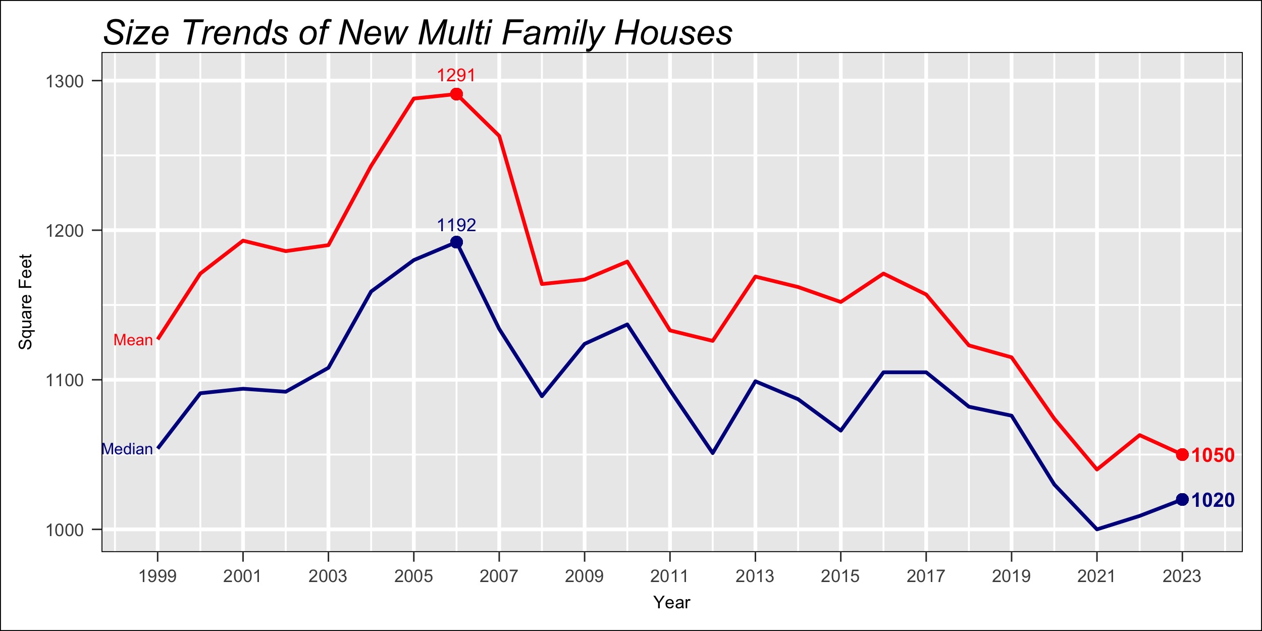
The chart to the right displays the historical annual trend in the size of multifamily housing units. Biggest units were built in 2006, with the median at 1,192 square feet. The average multi unit size was almost 100 sq. ft. larger than the median that year, measuring 1,291 sq. ft. 


One reason for the significantly larger multifamily units built in 2006, when the median size rose from around 1,100 sq. ft. to nearly 1,200 that year, is that a larger number of those units were built for condominium purposes, rather than for apartment rentals. Condominium units, which are homes owned by the persons living in them, tend to be larger and with more amenities than rental units.  
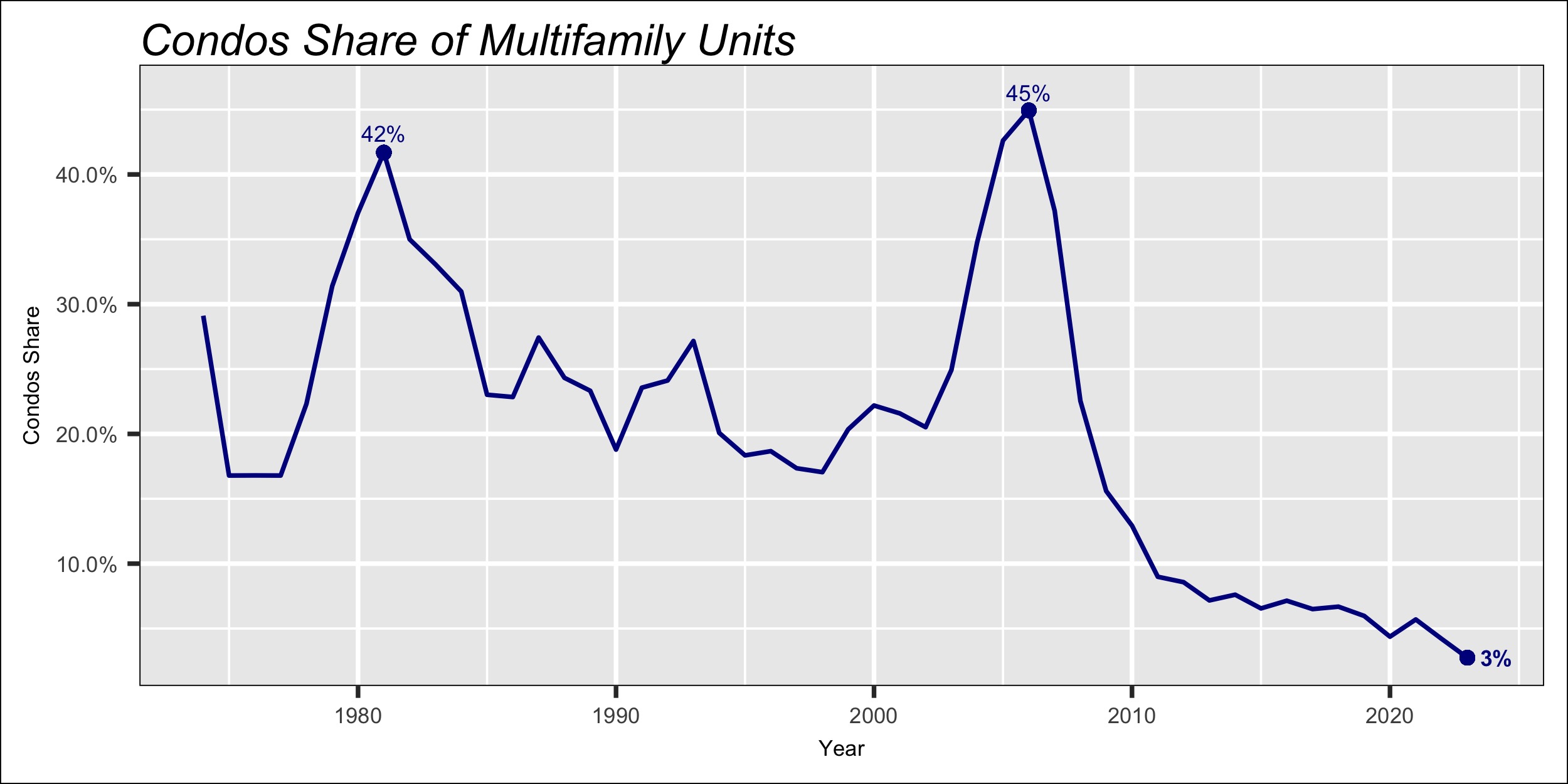
In 2006 nearly half of the multifamily units, 45% actually, were built for condominium purposes. Prior to that year fewer than a quarter of the units were condominium with the significant exception in the early 80s. In 1981 condominiums accounted for 42% of all multifamily units built that year.

Last year, as can be seen in the chart nearby, condos had fallen to just 3% of the multifamily units, the lowest historical level. Incidentally,  a few of the single family homes are also built/sold as condominiums. In 2022 they were less than 3% of all single family houses.

Regional Patterns

Similar to the national trend in the size of single family houses, all four regions also had reductions in house size. The declines ranged from a small drop of 2.2% in the South region, to a relatively large one in the Northeast were the average single family house was 8.4% smaller.  

The average size of new houses in the Northeast region, which always leads the nation with the largest homes, fell to 2,572 sq. ft. This is down from over 2,800 sq. ft. in 2022 and, as can be seen in the chart below, this region's single family homes have also exceeded 2,800 sq. ft. in two previous years- 2014 and 2015.


Builders in the Midwest region produce the smallest houses in the nation. In contrast to the Northeast, new single family houses in this region are always smaller than any other region's. Since 1999, when house data at the region level first became available, Midwest new houses have been 150 sq. ft. smaller than the national average. Last year they were 159 sq. ft. smaller. 

The size of new houses in the South and West is closer to the national averages. The South region's are on average 34 sq. ft. larger than the nation's, although last year were 43 sq. ft. bigger.

The West region's houses have been smaller than the national average since 2009. But overall this region's houses have been 24 sq. ft. smaller. Last year the gap was 72 sq. ft.

Regional Multifamily New Housing

On the multifamily housing side we find that one of the regions, the Midwest, bucked the national decrease in the average size of multi housing units. That is, the average size of multifamily units in the region rose last year to 1,050 sq. ft., just barely higher than in 2022.


The declines in housing unit size in the other three regions were relatively mild. New multi units in the South region saw the largest drop, falling 2.7% or 30 sq. ft. to 1,068 sq. ft.

New multifamily housing units in the West region were 1.2% smaller last year, with a reduction of just 12 sq. ft. in one year. 

Implications of the trend towards smaller houses


Smaller houses naturally imply a reduced demand for a variety of products. For instance, in terms of volume last year's reduction in the size of new single family houses represents a drop of nearly 43 million square feet of floor space. This implies a reduced demand for flooring
materials such as carpeting, wood, or vinyl. 

Although the reasons for smaller houses are unclear, they could be the result of builders trying to reduce costs or simply that consumers are finally demanding smaller houses. The average family size or persons per household has been declining for many years. Additionally, the number of one-person households has increased. All these factors point towards smaller houses. 

Wednesday, February 14, 2024

New Housing in Metro Areas

 Housing starts fell nearly nine percent last year to 1.41 million units, for only the second annual decline since 2009. Both the single and multifamily segments fell. Single family was down 6.0% to a preliminary 944 thousand houses, but new multifamily construction fell more sharply, down 14.4% to 469 thousand units.

Similarly, the number of housing permits also fell, although by a larger 12%. Total number of permits issued last year was 1.47 million, single family was 6.9% fewer at 908 thousand units, and multifamily was down 18.6% to 562 thousand units.

The right panel in the chart, shows monthly starts and permits data for the last two years. Latest data are for January of this year, with housing starts running at a 1.46 million unit annual rate, and permits slightly higher at a 1.49 million rate. While both starts and permits fell throughout 2022, activity stabilized most of last year.

Based on the Fed's latest pronouncements, we do not expect significant changes in mortgage rates over the next couple of months. This suggests we should not see material improvement or deterioration in the housing markets.  

Last year's decline in both housing starts and permits naturally results of declines in a majority of metropolitan areas. Although new residential construction improved in a number of metro areas.

On a geographic basis, we find that new housing construction is concentrated in a few of the metropolitan areas. The top 15 metros, depicted in the chart to the right, account for 43% of  the total housing permits issued last year. But these 15 are only 4% of all the 387 official metropolitan areas in the country. That is, just 4% of the metros represent 43% of all housing construction.

Along with the nation overall, most of these 15 metro areas saw fewer housing permits last year than in 2022, but three of them actually saw an increase. We can see in the right panel that Nashville permits were 27% higher in 2023 than the prior year, Charlotte saw 8% more permits issued and the Miami-Ft. Lauderdale metro area had 7.7% more permits. 

Note that the two top metros, Houston and Dallas, combined represent 12% of the nation's new housing construction. In other words, one in eight house permits took place in both of these areas. The top six metros in the chart account for one quarter (25%) of the nation's housing permits. And the fifteen metros shows in that chart contribute 43% of the total housing permits.

 Twenty one metro areas account for half of the total permits, and just 58 of the 387 metropolitan areas account for three-quarters (75%) of the total housing permits.

The geographic concentration of housing varies whether it's single or multifamily housing. Although several metropolitan areas are dominant in both market segments, such as Houston or Dallas-Ft. Worth, other metros predominate in either single family or multifamily housing, but not both. Such is the case of Jacksonville, Florida which shows up with high number of single family houses but vary few multifamily, or Minneapolis metro area with high number of multifamily housing but relatively few single family units.

The top single and multifamily housing markets are shown in the chart below.

Finally, for illustration purposes, the two charts below display the trend in total housing permits for each of the top 16 metro areas. The red line in each of the individual graphs represents the growth of total housing permits since 2010. That is, each point indicates the percent change in housing permits from 2010. For comparison, the U.S comparative growth is shown by the black lines. 

The numbers at the end of each line is the average growth in permits between 2010 and 2023. That is, the total growth in the number of permits divided by 14- the number of years. Also, we have colored three of the charts in pale yellow to highlight the fact that permits in these metros grew further last year, unlike the other areas where growth has stalled or fallen.


Sunday, February 4, 2024

U.S. Homeownership

Data recently released by the Census Bureau reveals that the U.S. homeownership rate fell to 65.7% in the fourth quarter, down from the year before. The decline was very modest, the rate fell by just 0.3% keeping homeownership within the narrow band it has maintained over the last five years.

The homeownership rate has ranged in the last four years less than one percent, from a low 65.1%, in the fourth quarter of 2019, to the 2022 high of 65.9%. However, the gains made in homeownership between 2016 and 2020, when the rate rose by two percentage points, have stopped.

Further, as can be seen in the chart, the current rate is barely higher than what it was in 1980, when 65.5% of households owned their home. More than four decades of government policies have not made the American dream possible to a greater percentage of households.

But the latest drop in homeownership was not widespread across all age groups. Households headed by a 55 to 64 year-old saw their ownership rise by just under half a percent, 0.3% in fact, to  76%. This is the second highest rate among all ages, as can be seen in the left panel in the chart below.

The biggest decline in ownership was among the youngest households, that is those headed by persons 34 years or younger. Their homeownership rate fell by six-tenths of a percent (0.6%) to 62% in the fourth quarter. Yet this decline does not make a major dent on the gains effected in the five year period 2016-2020, when the homeownership among the youngest households had risen by 3.8%. The under 35 year-old households enjoyed the biggest gains among all age groups in that period.
 

The other groups with a drop in the homeownership rate were the 35 to 44 years, down by two-tenths of a percent (0.2%), and the 45 to 54 year olds, whose rate fell by three-tenths to 70.3%.

Back to the future

The earliest homeownership data by age group from the Census Bureau is available beginning in 1994, even though overall rate for all U.S. households is from 1964.  Based on the age of household data, the national homeownership rate has fluctuated from 64.2% in 1994 to 65.7% today, but rising as high as 69.2% in 2004 at the height of the housing boom/crash earlier this century. 

The 1.5% increase in homeownership over the last 19 years results from gains among the youngest and oldest households, compensated with losses among the middle age groups. Households headed by persons under 35 years rose by just 0.1%, but elder households 65 and over rose by 1.3%.

The homeownership rate among the other three age groups is lower today than in 1994. The 35 to 44 year olds is 2.7% lower, the 45 to 54 is 4.6% down, and the 55 to 64 group is down 3.2%.

Homeownership Among Race & Ethnic Groups

The Census Bureau also provides homeownership data for major race groups, including Hispanics. The left panel in the chart below displays the latest ownership rate for the various groups. White households, as is well known, have the highest rate with 73.8% of households owning their home. Although the rate fell last year by 0.7% it is 3.6% higher than its level back in 1994.


Asian households post the second highest rate, 63% of them owned their house at the end of last year, 1.1% higher than in 2022. Although data for Asian households had not been collected prior to 2016, since that year their homeownership has risen by 6.4%.

Hispanic- and Black-headed households have the lowest homeownership rates, with Hispanic latest rate of 49.8%, and that of Blacks almost four points lower at 45.9%. The homeownership for Hispanics and Blacks had been nearly equal until 2004 when both declined as a consequence of the housing collapse that started that year. But when the housing market began to improve around 2010, the homeownership among Hispanics recovered faster. 

Hispanic households' rate has risen 7.6% since 1994, while Black's have gained less than half, 3.3%.

Politics anyone?
 
Government policies naturally have an impact on housing and homeownership, often unfavorable despite the good intentions. Most dramatic, and damaging it turns out, were the policies enacted in the late 1990s and early 2000s aimed at bolstering homeownership, such as the Community Reinvestment Act. These policies combined with easier lending practices adopted by banks and mortgage companies, and encouraged by the government, led to what came to be known as the subprime mortgage crisis with dire consequences for millions of households who subsequently lost their home. 

For illustration purposes, the chart below displays the path of homeownership for the last thirty years, highlighting the president and his political party throughout this period. Without any deep analysis we can easily see that neither party's policies proved to be more beneficial or detrimental to homeownership than the other party.


Monday, January 29, 2024

U.S. Unemployment Rate

 The U.S. unemployment rate has deteriorated slightly over the last year. While the rate was 3.5% at the end of 2022, by the end of last year it had worsened to 3.7%. Not a big change but an adverse change nonetheless. In fact, the rate has been at or above 3.7% in each of the latest five months. 

On a generational basis, the unemployment rate has worsened for people in two age groups. For the youngest workers, those between 16 and 19 years of age, the rate rose by half a point from 11.4% in December of 2022 to 11.9% at the end of last year. The other group posting higher rate at the end of 2023, is the 25 to 34 year olds, which went from 3.9% to 4.2%. This can be seen in the chart below.

Another perspective is a comparison of the unemployment rate geographically. As one would expect, there are differences in unemployment across the various regions in the U.S. Naturally, we find that some states have a rate higher than the national average of 3.7% and, conversely, the rate for other states is better (i.e. lower) than the total U.S. 

States in the map below in red shades are those whose current unemployment rate is higher than the national average and, conversely, those states with rates below the national average are shown by green shades.

We can readily see that states in a swath from Washington to Texas all have a rate higher than the national average; except for Oregon which posted a December rate of 3.7%. There are also some states towards the East-Central part of the nation, from Illinois to New York with (relatively) high unemployment rates. 


Nevada currently posts the highest rate in the nation with a December 2023 rate of 5.4% unemployment. It also has exceeded the U.S. rate every month since 2007.  The average unemployment rate in Nevada, from 2005 to December last year, has been 1.8% higher than the overall U.S. rate.

California, Illinois, and New Jersey are other states with currently highest rates. California is also one of a handful of states whose unemployment rate has been above the national average for all of the available data history. The other states with unemployment rates mostly above the national average are Illinois, Michigan and Kentucky.  

At the same time, there are several states which have consistently maintained unemployment rate below the national average. Among this group we find Maryland with 1.9% unemployment rate in December. This state's average rate is 0.81% below the nation's rate.  Montana's rate is 1.4% below the U.S. rate, Utah is 1.9% below,  and Iowa is 1.8% lower than the U.S. Both Dakotas are also better than the nation, with South Dakota's average 2.6% below the U.S., and North Dakota even better with 2.9% gap from the national rate. 

Other states performing better than the overall U.S. are Idaho with an average unemployment rate 1.1% below the U.S. , Virginia is 1.4%, Kansas is 1.3% lower and Vermont is 1.9% below. 

While the total U.S. unemployment rate has deteriorated over the last year, as we mentioned above, many states bucked this trend. 

The map below displays the change in unemployment rate between December 2022 and December of last year. States whose unemployment rate has deteriorated more than the nation, that is the rate has increased more than the U.S. change of 0.2%, are shown in shades of red. 

A few states stand out with an oversize increase. New Jersey's unemployment is 1.5% higher than a year ago. Similarly, California is one percent higher and Alaska is 0.8% higher. Montana, Colorado and Missouri post rate 0.6% higher than in December 2022. 


States with improving unemployment rate are Oregon, 1.1% lower today, Maryland also 1.1% although impossible to see in the map. Other states are Wyoming (0.9% lower), Hawaii (0.8%), and Pennsylvania and Vermont both also 0.8% lower. 

An exploration of the relationship between industry concentration and states' unemployment rate was unsuccessful. Deeper analysis is required for an explanation of the variation of unemployment among states.

Wednesday, December 20, 2023

U.S. MANUFACTURING

I covered this topic eight years ago (http://econlives.blogspot.com/2015/11/) and, given the goverment's industrial policies emphasizing support for manufacturing,  it is now a good time to revisit it. My argument then was that the idea that reshoring manufacturing would bring back jobs was misleading.  Production and shipments were increasing but the number of jobs was mostly declining, even though jobs may have increased in a few short periods.

The recent push towards manufacturing has resulted in a surge in the construction of manufacturing structures. In the seven-year period between 2015 and 2021, spending for manufacturing construction averaged $77 billion annually. Spending jumped to $117 billion last year, and is currently running at over $206 billion. That is, more than twice the two years ago pace. Historically, manufacturing was 7% of all private construction but this year it has nearly doubled to 13% of the total.  

All of this construction should lead to increases in manufacturing output and employment. Although the extent to which employment will increase is unclear. It depends on, among other factors, on the specific manufacturing industry where construction is taking place, and on how capital intensive is the investment effort. 

The chart below shows manufacturing employment back to 1939, where we have indicated a few economic events or government policies impacting the manufacturing sector. We must keep in mind that their effect on employment is not immediate, but takes some time to work itself through the economy. For example, the signing of the NAFTA agreement on January 1994 did not result in the "giant sucking sound" of jobs lost to Mexico, predicted by Ross Perot during his failed presidential campaign. Manufacturing jobs continued to rise for at least another four years until the "dot com" recession around the turn of the century drove manufacturing employment and production down.

Economic recessions do showclear impact typically with a contemporaneous decline in employment. This is partly because changes in employment are one of the key factors used to define an economic recession.


Manufacturing employment drops during recessions, sometimes very dramatically. For the twelve recessions covered in the chart above, manufacturing employment fell at twice the rate of overall private jobs. For the period covered in the chart, private jobs fell an average 4.5% in recessions, but manufacturing dropped a larger 8.5%. In only one recession, the "Covid" one early in 2020, we find manufacturing employment falling less than overall employment. 

Looking back at the Great Recession, that is between December 2007 through June 2009, we find that the number of manufacturing jobs fell by over two million, or a 15% drop in under two years. The decline in manufacturing jobs was more than twice the drop in private sector employment overall, which saw a 6.5% reduction during the recession. 

But since mid-2009, when the recession was officially over, manufacturing jobs have increased by 1.2 million. That is, today there are 10.5% more jobs than were back at the bottom of the recession. Despite these gains employment is still a long way from the pre-recession, December 2007 level of 13.7 million jobs- that is 786 thousand more jobs than today.


Looking at a shorter time period, shown by the chart above, we see in the left panel the trend in number of manufacturing jobs since January 2010. Employment rose roughly one percent annually until reaching a high of 12.8 million in January 2019. It declined slowly for the following twelve months until February 2020 when the government-mandated Covid shutdown caused a collapse in manufacturing employment, bringing it down to 11.41 million. Note employment is lower than in Feb/Mar of 2010 at the bottom of the 2007-09 recession.

The economy rebounded sharply when the economy opened up around June 2020. While manufacturing employment rose just 0.1% monthly between 2010 and 2019, the monthly increase between April 2020 and December of last year jumped to 0.4%. By the end of last year it exceeded pre-pandemic level, but growth has stagnated this year, as can be seen in the right panel of the chart above. Growth flattened and, in fact, we can visually appreciate a modest declining trend. The surge in employment ended at the beginning of this year.

Manufacturing continues to lose ground
Even though manufacturing employment has generally increased since 2010, ignoring the sharp drop during Covid, the sector has lost ground compared to total employment.
While manufacturing jobs accounted for one in three of all U.S jobs, 32.3%, in 1948, it has steadily fallen over the last 70 years to one in twelve jobs (8.3%) today. The chart to the right illustrates the secular decline in the manufacturing sector's share of all jobs. Compared to the private sector, that is excluding government employment, the decline is more pronounced, falling from 37% of 1948 jobs, to the current 9.7%.
The services sector has gained importance, with service jobs replacing all the goods-producing ones. Among all goods-producing industries manufacturing posts the biggest declines. Its share all  jobs fell 24% over the last 75 years. This decline is much greater than most other sectors, the next highest drop is the Federal Government whose employment share is currently only 2.3% lower than in 1948, and Information down 2.0%. 

Within services, Professional & Business Services has gained the most. Currently, it accounts for 23.0 million jobs, that is 14.6% of total employment. This sector represented 6.5% of all jobs back in 1948 and it currently is holds the largest number of jobs, even exceeding government employment which had the most workers until February 2022.

Wages in Manufacturing Jobs
A key claim of the government's industrial policy is that it supports investments in manufacturing with the promise of "high-paying" jobs. However, "high-paying" depends on which specific industry within manufacturing sector gets the support. Also, whether the emphasis is on all workers or just production workers.

Overall, manufacturing jobs post an average hourly wage of $32.87, that is 12% higher than average for all private sector workers. However, all production and nonsupervisory workers, that is "blue collar" workers, have an hourly wage of $27.87 or 9% below the average for all private business workers.

The chart below displays data for "all workers" in a number of industries in manufacturing, with the vertical axis displaying the average hourly wage, and the number of jobs change since 2010 along the horizontal axis.  Each circle is a manufacturing industry with the area of the circle reflecting the number of jobs- bigger circles indicate greater employment. Note that we duplicate some of the data in the chart. That is, some circles reflect industries that may be included in other circles. Such is the case for Aircraft, shown at the top of the chart, which is included in the Aerospace circle shown immediately below.


We can see there are many industries within manufacturing whose wages are below the national average. There is no clear pattern and very low correlation between industry size and average wage, or employment change and average wage. We are as likely to see a large industry, i.e. a bigger circle, with high or low wages. Nonetheless, it's clear that the more technical industries, e.g. Computers, demand higher wages than more prosaic industries such as Food or Apparel

We said above that there is a wide range in manufacturing wages among the individual segments or industries. They range from a low average wage of $23.21 an hour for Animal Slaughter, or $23.36 for Seafood Processing. Note that the data exclude benefits or any other payments outside the stated hourly wage.

At the high end of the range we find workers in Aircraft manufacturing earn an average of $53.28 an hour. Manufacturing of Semiconductors & Electronic Components command $46.49 an hour, and manufacturing workers in instruments for Navigation, Measurement and Control make an average $45.28 an hour. 

In the chart below we show the range in hourly wages of the major industry groups within manufacturing. Note that the manufacturing groups shown include several industries. For instance, Transportation Equipment with an average wage of $38.06 includes Aircraft Manufacturing with an average $53.28, Motor Vehicles ($38.26), Vehicle Parts ($29.41) among others. 


Government support of manufacturing thus has a different impact on which sector or industry is chosen. Even picking a sector that currently pays relatively high wages, such as Motor Vehicles contains several industries feeding it with lower than average wages. Manufacturing industries feeding it include Vehicle Body Work with $29.54 hourly wage, Vehicle Parts with $29.41, and Vehicle Electric Equipment manufacturers with a $28.00 hourly wage. 


Monday, November 20, 2023

Smaller Houses

 Newly built houses are getting smaller and smaller. Single family houses started in the third quarter of this year were 2,430 square feet, average size. This is 82 sq. ft. smaller than a year ago. For multifamily units the average size also fell, to 1,032 square feet which is 55 sq. ft. less than the same quarter last year. This is according to the latest housing starts data release from the U.S. Census Bureau.

The decline in house size, on top of the drop in the number of houses started this year, implies smaller demand for construction products going into residential sector. Year to date through October 153 thousand fewer houses were started than in the same period last year. Fewer houses combined with the reduction in house size translates into a loss of 10.9 million square feet of floor space so far this year (approximately). 7.7 million is from single family houses and 3.2 million in multifamily housing units. 

House size has been falling for at least ten years in both single and multi family houses. Single family houses were largest in 2013, when their average size was 2,701 square feet, 271 square feet or 10% larger than today. 

The median size of houses has also fallen during the same period. The median for single family houses was 2,221 sq. ft. in the third quarter, also 10% less than its peak size of 2,491 sq. ft. in 2013.

The decline in the size of multifamily housing units has been falling longer. Peak size was reached back in 2007 when the average multi unit measured 1,342 square feet. That is, multifamily units were 310 sq. ft. bigger that year.

One reason explaining larger multifamily houses around 2007 is that a greater number of units were built to be sold as condominium houses. Condominium multifamily units are typically larger than rental units. For instance, in 2007 four in ten of the units (40%) were destined as condominiums- 60% were built for rent. In contrast, virtually all the units built last year (97%) were rentals. 

Regionally, we find that the Northeast has the biggest new single family homes. The average size in this region in the third quarter of this year was 2,562 square feet, although it declined by 6.9% or 189 sq. ft. from last year. This year's sharp drop brings the average size in this region closer to what it was in 2018.

The average size in the other three regions also fell, although by smaller percentages than in the Northeast Their average size also has declined over the last ten years. 

The second largest reduction in size was in the South region, with a 4% drop to 2.473 sq. ft. in the third quarter. The South region also boasts the second largest new single family houses.

The West region's single family houses are the third biggest of all four regions, with an average of 2,395 sq. ft. Also they had the smallest drop in size last year, new houses are just 1.2% smaller than a year ago.
The smallest single family houses are built in the Midwest region, with an average of 2,237 sq. ft. this year. The size of new homes in this region has also been declining for a decade now, ending with a 2.4% drop last year.

Similar to the regional trend in the size of single family houses, we find that multifamily housing units in all four regions have become smaller for more than a decade now. Further, with the exception of the Midwest region where houses this year are actually larger than a year ago, the size of multifamily houses fell last year in the other three regions.

The size of multifamily houses in the Northeast region saw the biggest drop this year, with a 10% decline bringing the average size to just 853 square feet. The South and Midwest regions had similar declines, of 8.1% and 8.2% each, respectively. The average unit size is also very similar with units in the South region measuring 1091 sq. ft. on average. This is slightly higher than the 1,056 square feet in the Midwest region. 

Housing units in the West region measure currently 995 sq. ft. on average, just 5.3% smaller than a year ago. 


Friday, November 10, 2023

Construction Markets

  • Total construction is up modestly 0.4% in September but a more robust 8.7% from last year.
  • The bulk of the gain from last year originates in the nonresidential sector, which is up 19% while residential construction fell by 2.1% since September of last year.
  • The principal growth drivers overall are Manufacturing buildings, up 62%, Education buildings, up 19%, Power buildings, up 16%, and Health Facilities, up 15%. 
  • Construction of manufacturing buildings rose $76 billion over the last year, accounting for nearly half (48%) of the increase in total construction. 

The U.S. construction market remains relatively strong overall, although signs of weakness are beginning to show up. Spending for all types of projects, public and private, rose 0.4% in September reaching just under two trillion dollars ($1.997 trillion annual rate). September marks the ninth consecutive month when spending for construction projects increased- bringing spending to a level 8.7% higher than the same month a year ago. In real terms, that is adjusting for inflation, spending is 5.5% above last year. 


Spending across the two major major segments, i.e. public and private construction, rose in September (see left panel of chart below). Total private construction is 0.4% higher than the previous month reaching $1,556 billion (that is $1.6 trillion) in September. Private construction accounts for 78% of the U.S. market and is 6.9% higher than last year.  

Public construction also rose in September, coincidentally by a similar 0.4% but to a smaller $441 billion. It is 8.7% higher than the same month last year and currently accounts for slightly over one-fifth of the market (22%.) September also marks all-time spending highs for both private and public construction.
Private construction has grown by nearly four times over the last thirty years. The data in the charts, which begin in January 1993, indicates cumulative growth of 352%; that is from $344 billion back in early 1993 to the 1,556 billion this year. 

Public spending for construction projects has also increased but at a smaller magnitude, rising by 287% over the same period. That is current spending of $441 billion is nearly three times the $113 billion in early 1993. 

An alternative segmentation of the data is the most common division between Residential and Nonresidential projects, shown in the right panel in the chart above. Both follow similar patterns although nonresidential lags residential by more than two years, reflecting the fact that it takes longer to initiate and complete nonresidential projects.  

Earlier this century, around the 2008-09 recession, residential peaked in January 2006 with $681 billion spent, while nonresidential peaked more than two years later in October 2008 reaching $719 billion. Both of them bottomed around 2012 and have risen sharply since then. 

The Fed's policies maintained over the last ten years or so had driven mortgage rates to levels below 5%- we had not seen rates below 5% since at least the early 1970s. Such low rates encouraged construction of both residential and nonresidential projects. Although the recent increases have not impacted nonresidential construction yet, their impact on residential is already evident as the chart above shows.

Residential Construction
  • The residential market remains relatively strong, driven primarily by construction of multifamily housing units.
  • Although it is expected that multifamily construction will ease in the near future as the record number of multifamily units currently under construction are completed. There are currently over a million units under construction, equivalent to roughly two years' demand.
  • Single family housing continues to fall.
The bulk of residential construction today emanates from the private sector. Residential buildings publicly funded are just around one percent of the total, except for a short period around the 2008-09 recession when public residential construction rose to about 5% of the total. Currently, public spending for residential construction lingers around ten billion dollars, a small figure in relation to the $882 billion overall residential market. 

Thus here we concentrate on the private sector, which represents the bulk of the residential sector.
Residential construction data from the Department of Commerce estimates is available for three different segments: new single family housing, new multifamily housing and expenditures by homeowners for remodeling. Combined these three segments are generating $872 billion annually, but adding the pubic sector the total rises to $882 billion. 

The increase in construction over the last few months originates from greater activity in both single and multifamily housing. Although new single family housing had been falling since early last year, it reversed course in May of this year but it barely reaches a similar level it had in November last year. That is, single family construction is running at slightly over four hundred billion ($402 billion annual rate, shown in the chart below). Single family rose 1.3% in September but it remains 5.9% below a year ago.
 
Multifamily construction, on the other hand, paints a more rosy picture. Construction of multifamily housing units has been increasing for at least a year now. However, the construction pace has been slowing down gradually, in September construction actually fell, albeit by a negligible one-tenth of one percent (0.1%). Spending on multifamily houses reached $136 billion in September, the highest amount ever recorded for this sector. 

We'd anticipate further declines in multifamily construction. The increases in mortgage rates, which have reached nearly eight percent recently and are one percent and a half higher than the beginning of the year, are forcing builders and developers to slow down construction. Further, the huge number of multifamily units currently under construction, which currently exceeds one million units, is putting pressure on builders when these units are completed and put on the market.  

Homeowner remodeling spending has also fallen recently- it fell in seven of the last twelve months. Spending in September was $334 billion, 5.4% lower than a year ago. Higher mortgage rates have made remodeling projects more expensive naturally.

Nonresidential Construction Sector
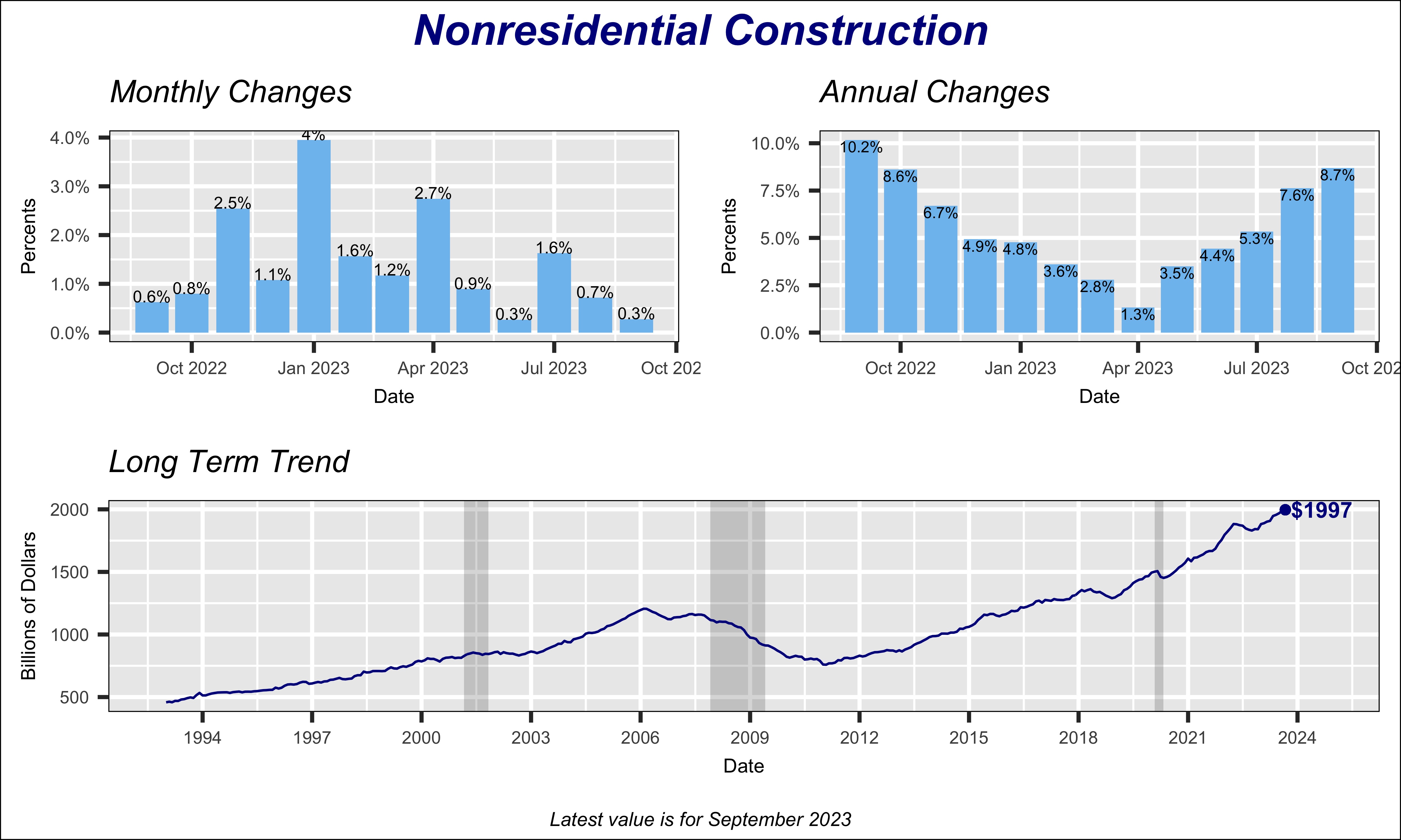
Overall nonresidential construction has been rising more or less steadily since 2011, to reach $1.11 trillion in September of this year (at annual rate.) Spending dropped modestly by 5.4%, in the aftermath of the Covid pandemic, between January 2020 and June 2021. But it recovered strongly since then by rising 33%     in the last year and a half. The growth pace has been slowing the last few months, however, as can be seen in the "Monthly Changes" graph in the chart below. Compared to September of last year, nonresidential construction is 8.7% higher.


Currently, the biggest contributor to nonresidential construction is manufacturing, shown by the red line in the chart below, which shows major nonresidential construction types as percent of the nonresidential total. Historically, construction of manufacturing buildings represented under 10% of total nonresidential market, except for a few years around 2015 when it briefly exceeded 10%. But the emphasis by Federal government policies to support a shift towards electric automobiles has boosted manufacturing construction to nearly 18% of the nonresidential sector. 


 Data Source: U.S. Department of Commerce